
Ovalo

*Self-initiated brief
Overview
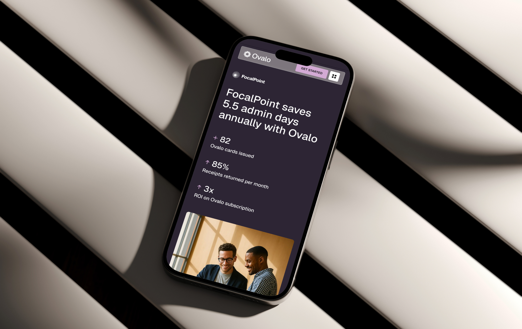
Ovalo is an all-in-one spend management and corporate card platform designed to give growing businesses real-time visibility and control over their finances. Entering a rapidly crowded European fintech market, Ovalo needed a foundational brand identity that could immediately establish credibility with financial directors while feeling intuitive and frictionless for the everyday employee. The project encompassed a complete brand strategy, visual identity system, digital product language, and marketing rollout, built to position Ovalo as the definitive financial operating system for modern enterprises.
Challenge
The B2B finance sector suffers from a polarised visual landscape. On one end are legacy banking institutions, highly trusted but visually stagnant. On the other end are modern B2C challenger banks, hyper-vibrant and engaging, but at times lacking the gravitas required to convince a CFO to trust them with millions in company capital.
Ovalo faced a dual-audience dilemma. The platform had to appeal to the strict, control-oriented mindset of finance teams while simultaneously winning over regular employees who view expense reporting as a tedious administrative chore.
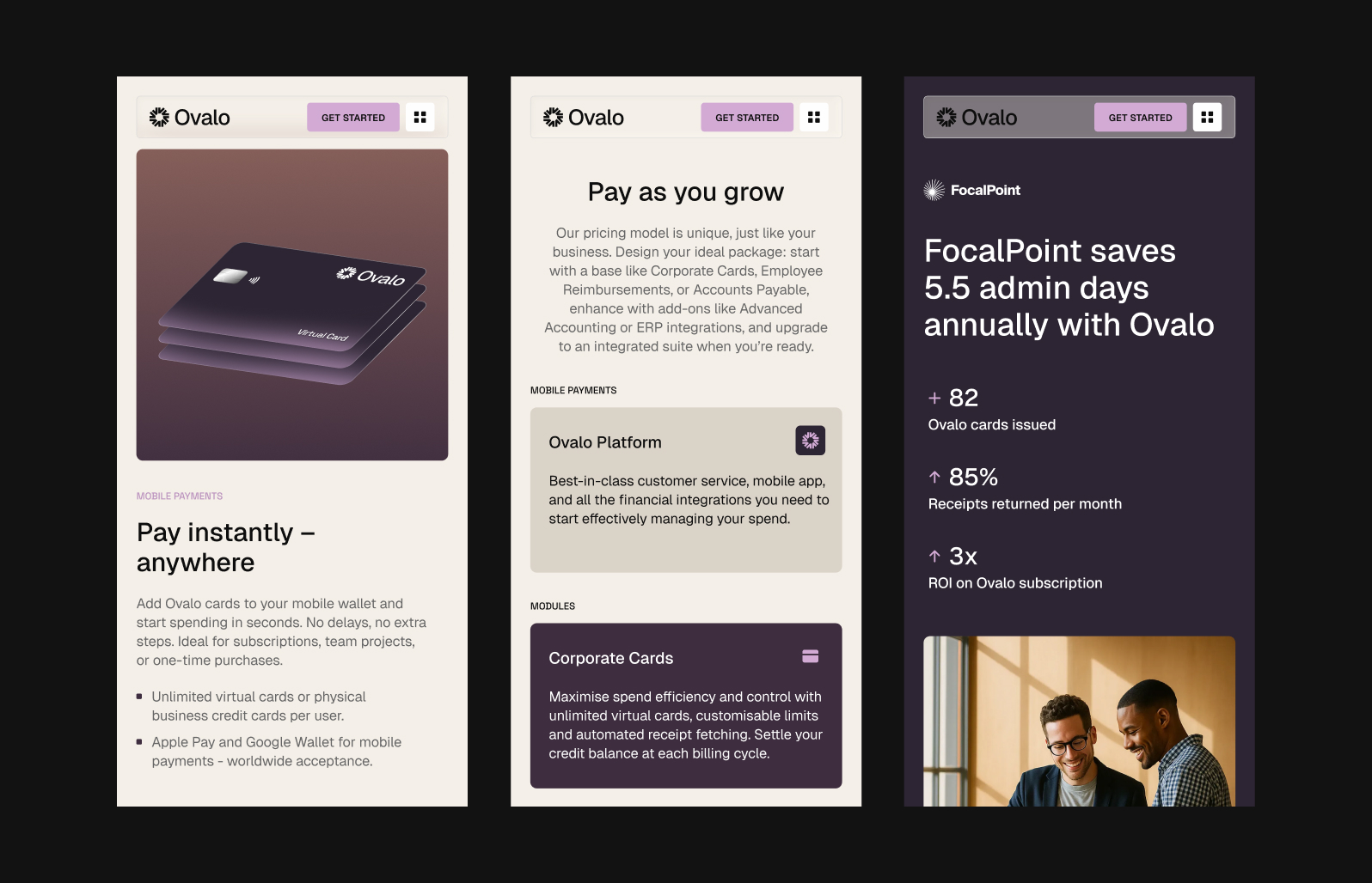
The core challenge was to create a visual identity that captured frictionless control. Therefore, the strategy was to design a brand that felt exceptionally secure and enterprise-ready, yet entirely stripped of the traditional corporate stiffness. Furthermore, the identity had to be highly functional, scaling seamlessly from a tiny app icon on an employee's phone to showcasing more complex data-heavy dashboard interfaces in a digestable way.

Approach
To resolve the tension between strict financial compliance and modern usability, the Ovalo identity was anchored in a design philosophy of "Warm Precision." The goal was to step away from the cold, sterile aesthetics of legacy banks and the hyper-vibrant, playful B2C challenger brands, opting instead for a highly sophisticated feel that commands trust while remaining deeply human-centric.
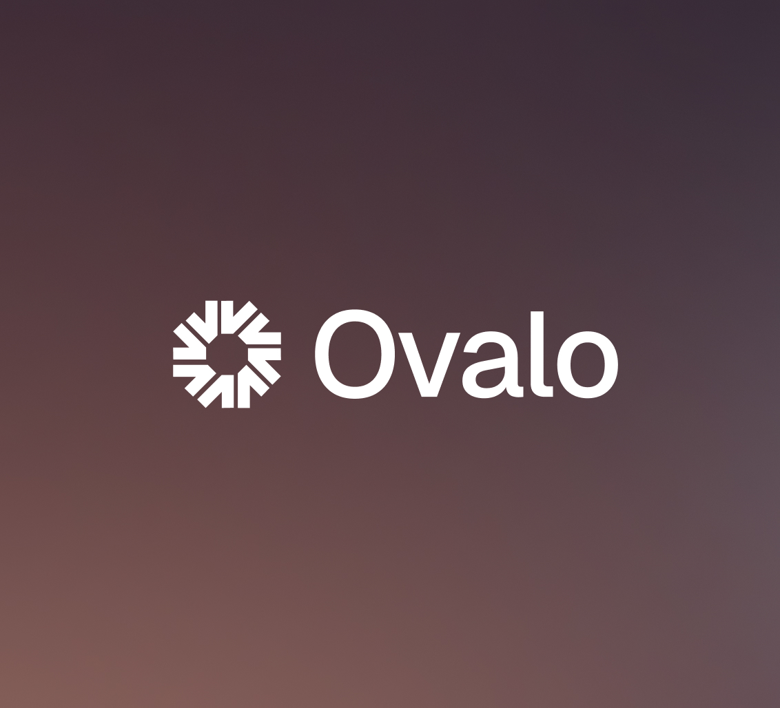
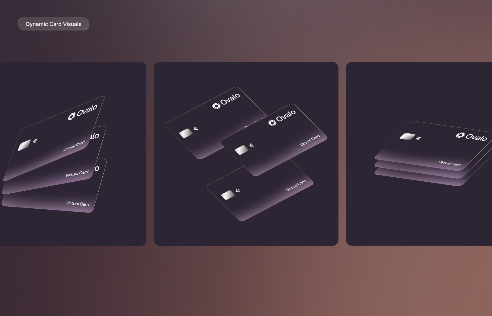
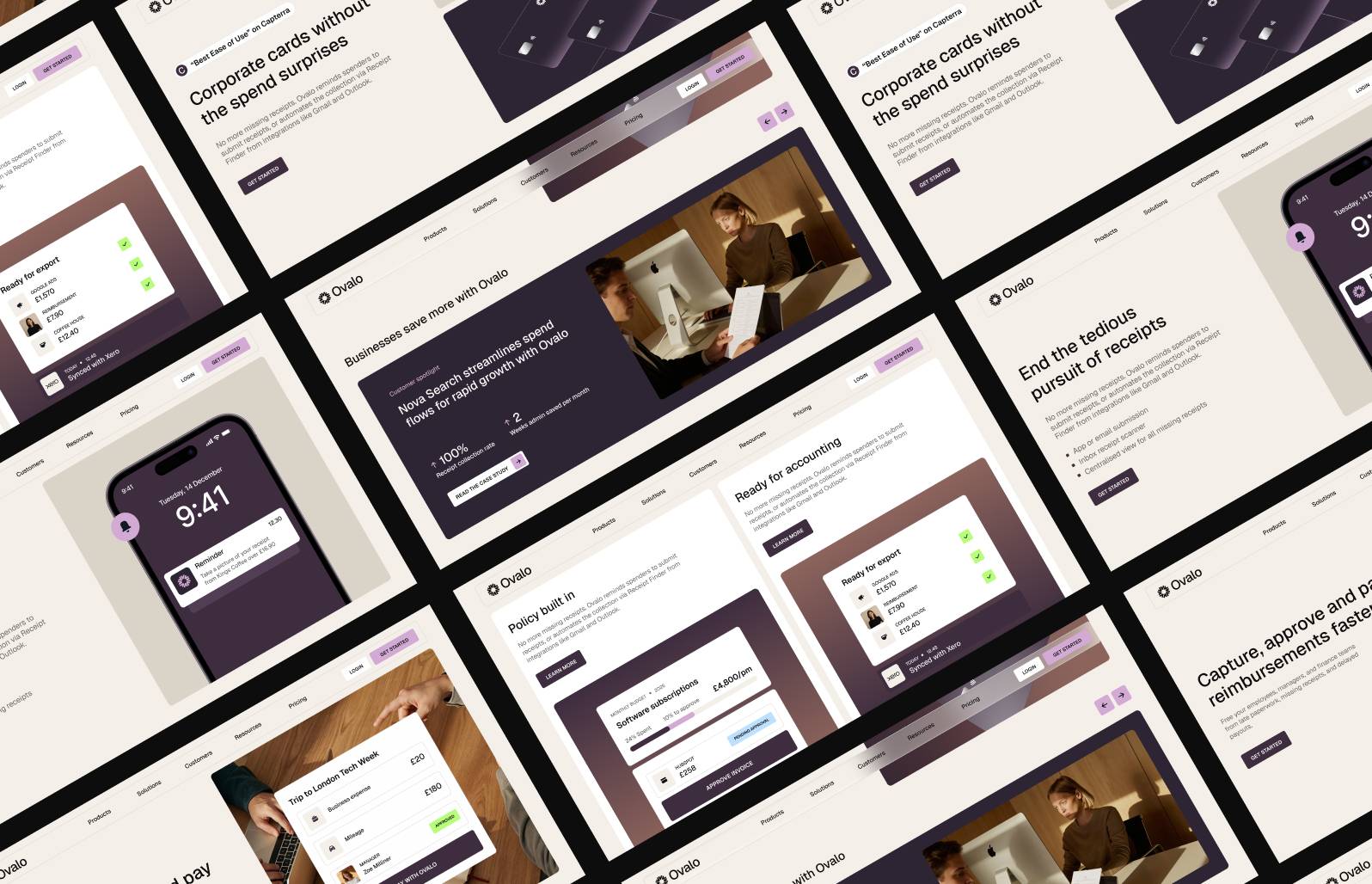
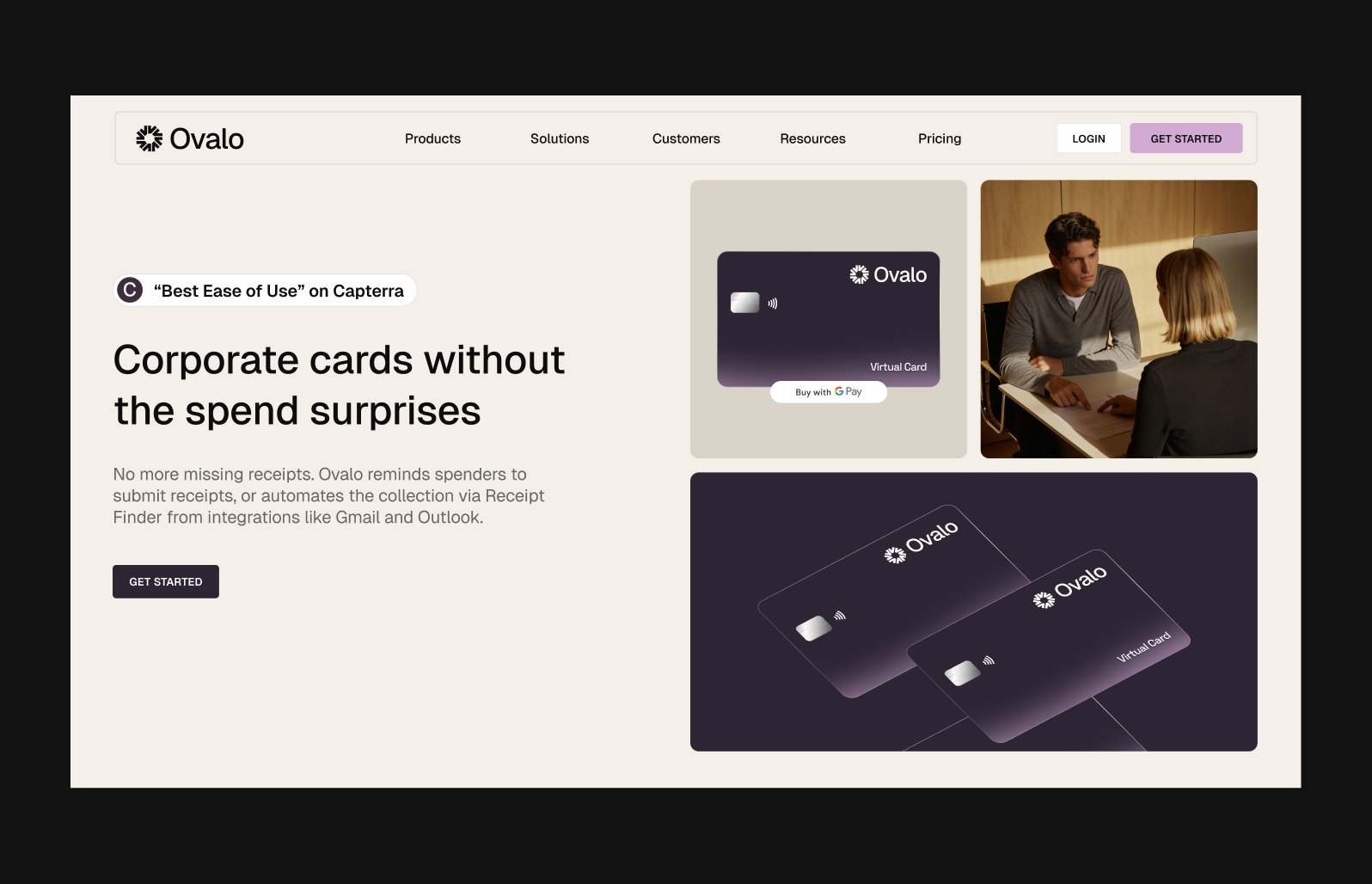
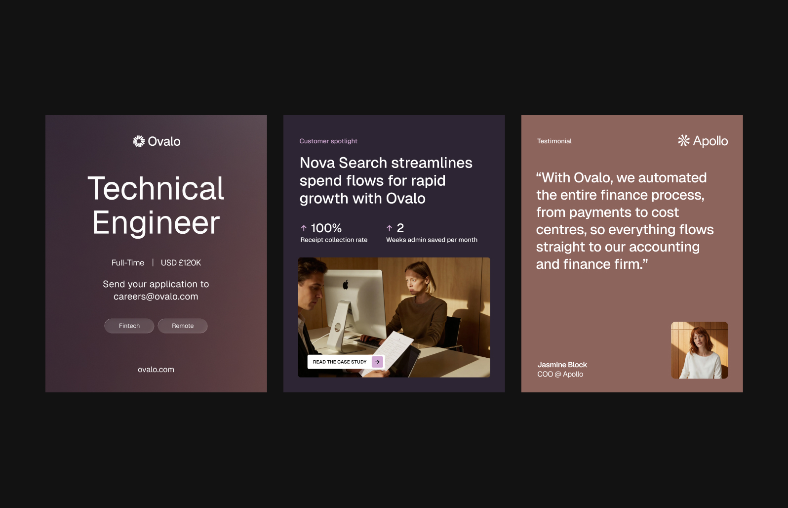
The Mark & Visual Language: The core identity is grounded by a geometric mark. This symbol visually represents centralised control and multi-directional financial oversight, pairing seamlessly with the approachable, rounded letterforms of the Ovalo wordmark. The broader visual language relies on soft gradients and ample negative space.
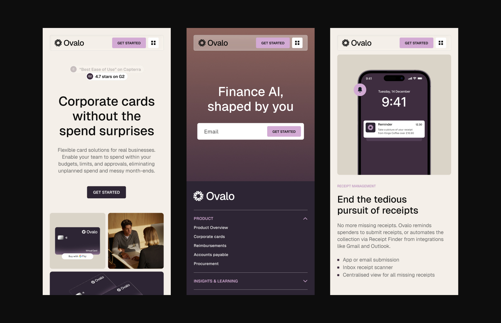
Colour Strategy: I deliberately abandoned the ubiquitous fintech blues and aggressive neon accents. Instead, Ovalo’s palette is uniquely warm and premium, built around deep, grounded plums and aubergines for high-contrast elements. These dark tones are set against calming cream, taupe, and off-white backgrounds. Soft lilac and dusty mauve accents are used to guide user actions and highlight data, establishing a calm, focused environment for managing company capital.
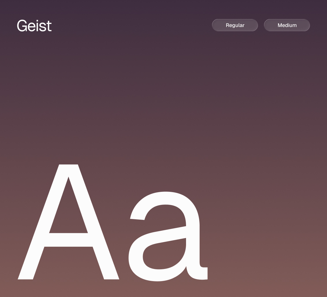
Typography: The typographic system is driven exclusively by the Geist typeface. Utilising varying weights (Regular and Medium), this crisp, modern neo-grotesque sans-serif does the heavy lifting across the brand. It provides structural clarity and strong legibility, while also delivering a contemporary and confident voice across marketing touchpoints and larger-scale copy.
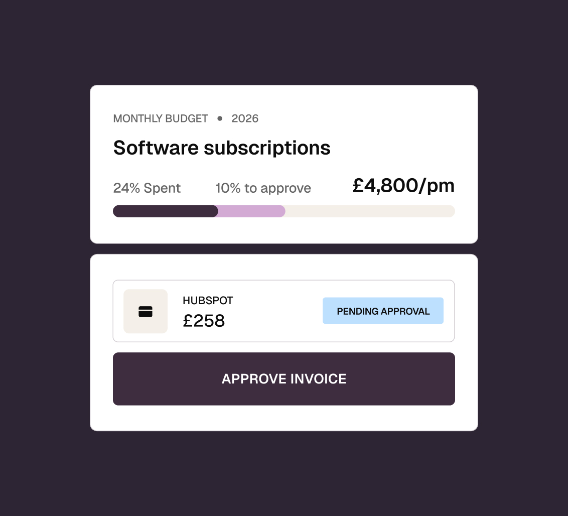
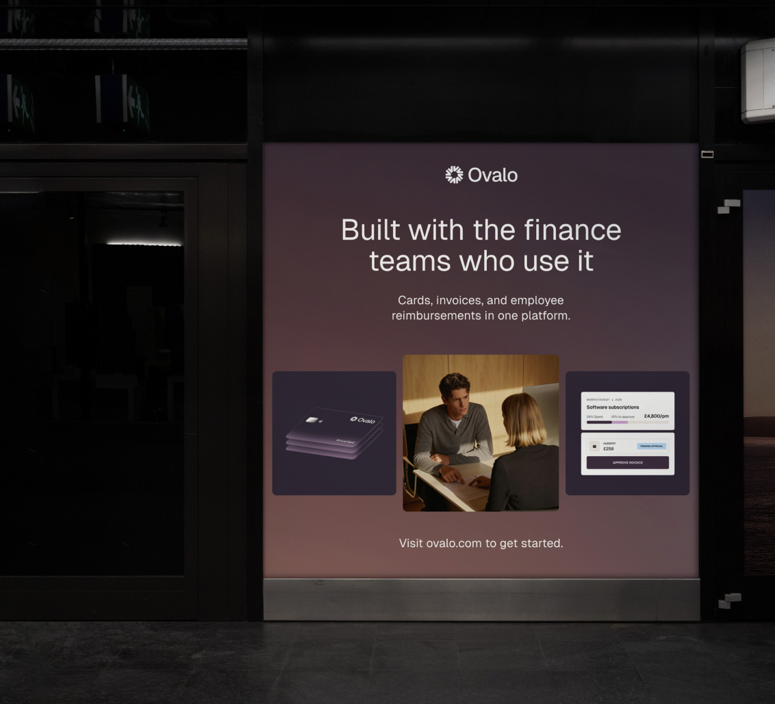
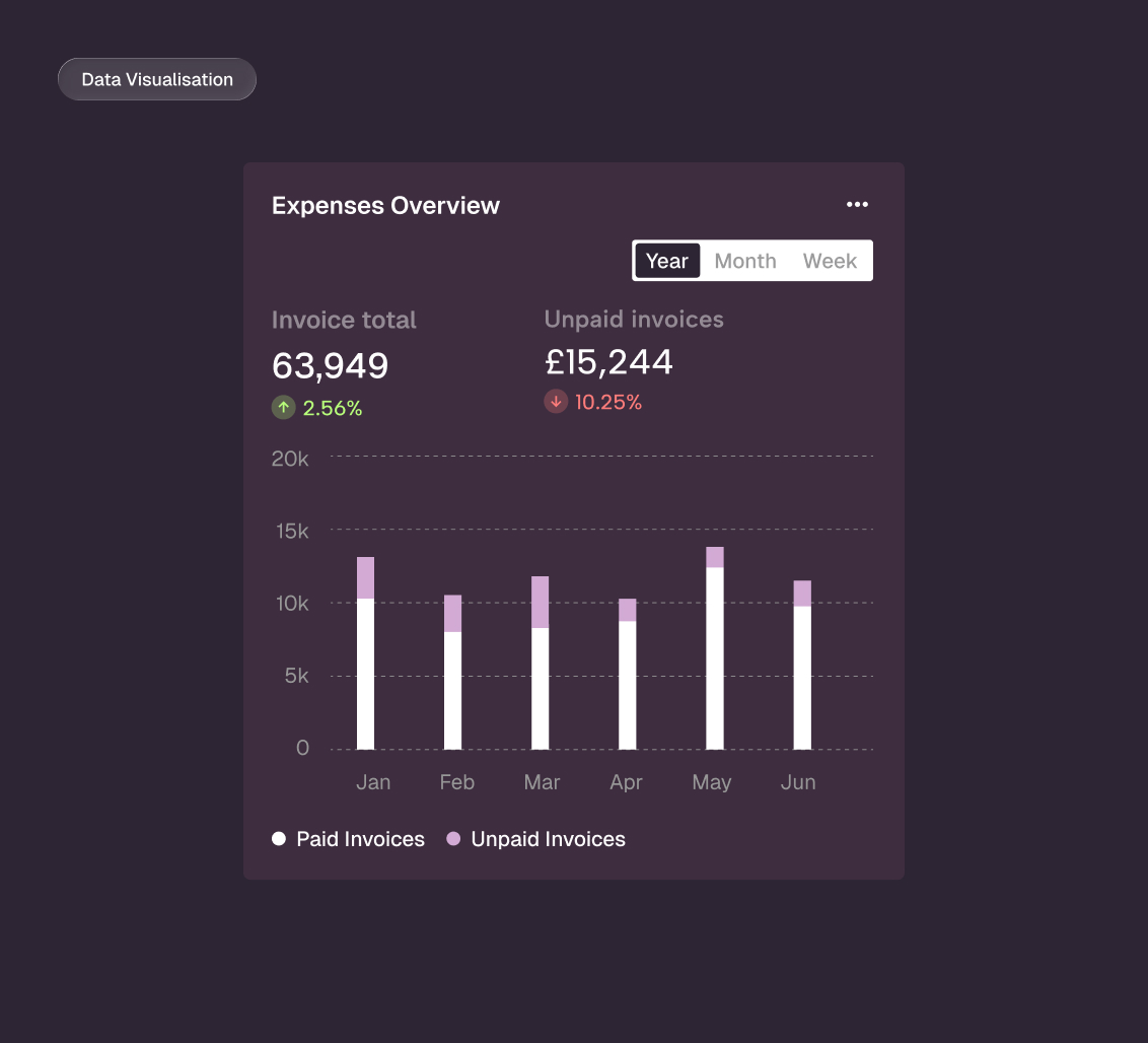
Data Visualisation & UI Components: Recognising that finance teams suffer from dashboard fatigue, the approach to data is heavily restrained. I stripped away complex 3D charts and unnecessary visual noise. Financial tracking and budgeting are communicated through clean, minimalist, card-based layouts featuring flat progress bars and charts. This ensures that complex actions like tracking software subscriptions or approving invoices, feel effortless and frictionless.
Deliverables
Brand Strategy
Brand Identity
Data Visualisation
Product-Led Visuals
Marketing Roll-Out

